«Back ·
Tracking: {
'Country Code': 'US',
'Language Code': 'EN-US',
'Email Hash': 'unknown',
'Vendor User Id': 'unknown',
'Vendor Id': 'unknown',
'Customer Type': '',
'Offer Code FONT Download


 Designer:
 Nick Shinn
Publisher: ShinnType
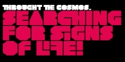
Phiz is a diverse suite of 27 decorative fonts based on Figgins Sans Extra Bold.
Classic (9 fonts), Rounded (7 fonts), Rough (4 fonts) and Particles (7 fonts).
The Rough and Particles styles emerge as a unique niche-neither imitating distressed printing (e.g. the "rusty" look), nor casual, hand-drawn styles. These type designs are conceived and executed as complex algorithmically-generated graphic procedures, in which repetitive elements have been artfully applied to the Sans capitals, and manually nuanced. As such they also differ substantially from textured glyph shapes that have been cut out from larger pattern fields, for the constituent particles are disposed in relation to the specific shape of each character they define.
The caps-with-small-caps format was chosen for two reasons. Firstly, titling display usage is predominantly capitals, and secondly, rather like optical scaling, having the same resolution of texture available in two different "sizes" (upper and lower case) should prove useful in the hierarchy of page layout-not primarily for setting upper and lower case text as caps-with-small-capitals, although this is of course an option. All figures and major symbols (punctuation and currency) are provided in both cap and small cap height.